The 2026 edition of the Women’s T20 World Cup is in full swing, and I have ranked all 12 nations uniforms from worst to best. This is just my opinion and everyone has their own thoughts and feelings on sports designs, so let me know your thoughts in the comments below. Where would you rank these uniforms?
12 – Bangladesh
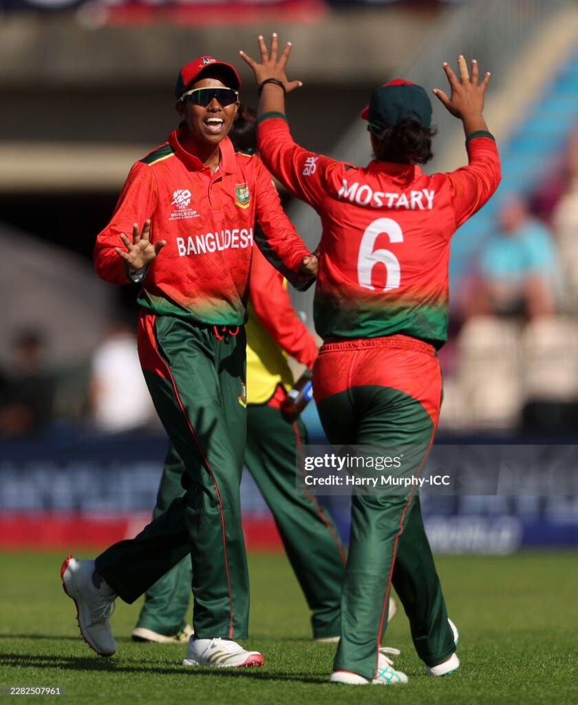
The Tigeresses from Bangladesh have unfortunately received last place in my rankings. A subtle jungle graphic gets lost on the red and green jersey and looks muddled. The gradient from red to green doesn’t work when the illusion is lost as the red on the backside of the pants interrupts the effect. One to forget for Bangladesh fans.
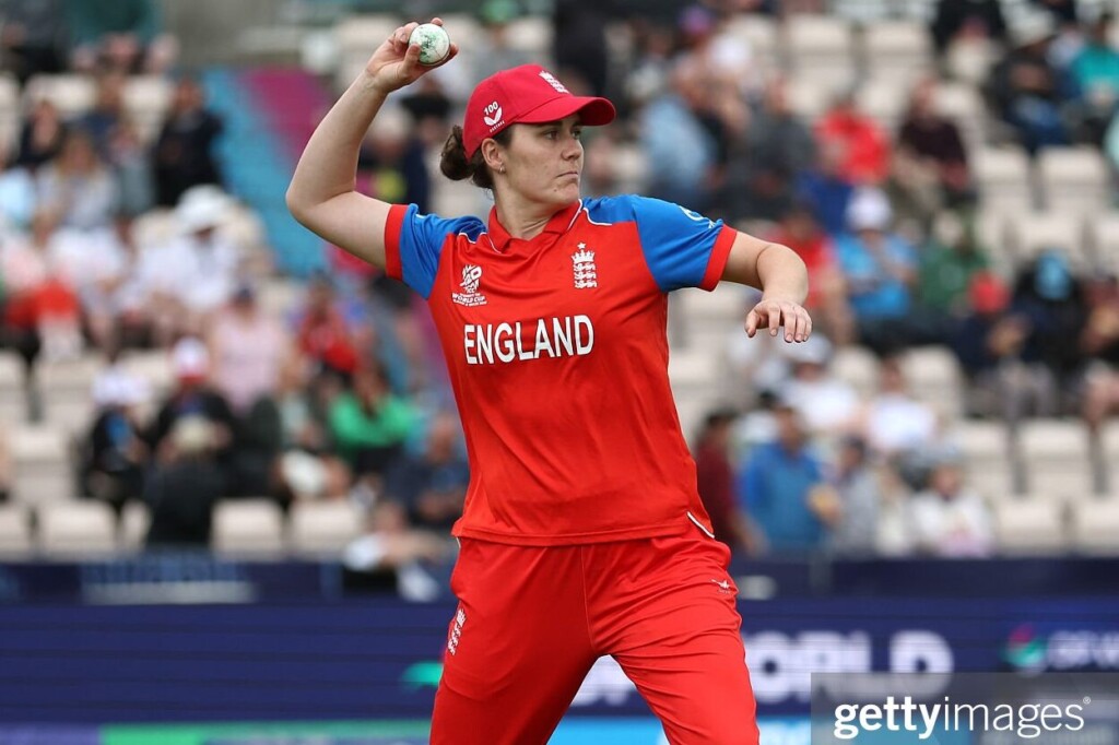
11 – England

England’s new T20 jersey is inspired by the classic red and blue of the mid-2000s and while it’s a nice throwback, it doesn’t really give us kit nerds much to talk about. The blue on the shoulders breaks up the completely red uniform, but it all is just a little boring from England.
10 – Australia
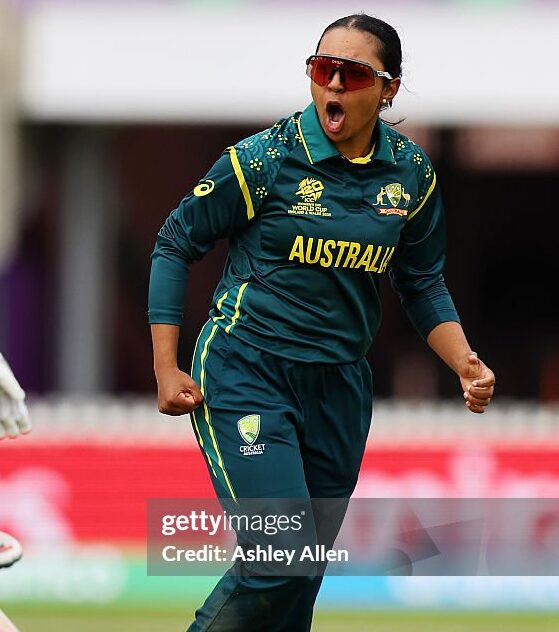
It pains me to put my beloved Aussie’s in 10th place but there’s not much to get excited about. A completely dark green uniform with yellow accents is pretty much all there is to it. There is a small indigenous pattern on the shoulders giving the uniform a little pizzaz but it’s a pretty tame effort again for Australia.
9 – India
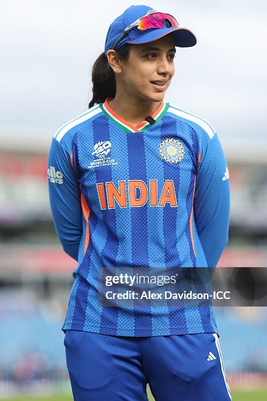
Adidas have given India a solid uniform starting with a nice two-tone blue striped jersey and the traditional adidas stripes on the shoulders and pants. The collar has the Indian flag colours which is a nice touch but it’s a safe jersey that doesn’t get me too excited.
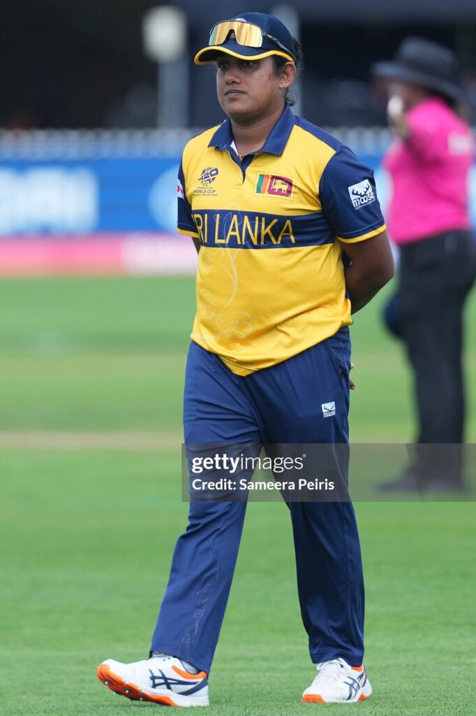
8 – Sri Lanka

Sri Lanka have been using this design since 2025 and while we’ve seen it a lot, I still like it. A blue chest band on a deep yellow base is a look not normally seen on the cricket field and even though it doesn’t do too much, it still works. There is a subtle flower graphic on the front and back, but it is only noticeable up close.
7 – Pakistan
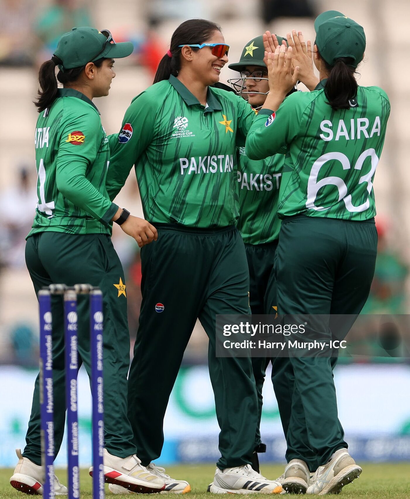
Pakistan have had this uniform for a while now so the novelty may have worn off but I do like that they used both a light and dark green on their uniform. A lighter green base on the jersey with a dark green vertical graphic, paired with dark green pants make this uniform solid, but not enough to compete in the top half of the uniforms in the World Cup.
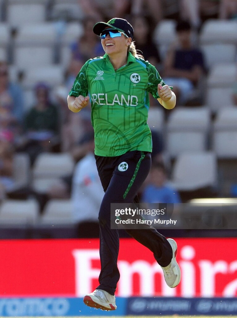
6 – Ireland

The new Ireland uniform takes inspiration from the rugged coastlines of Ireland and uses the distinctive geology of the Giant’s Causeway – a unique and iconic landmark in Ireland. The stripes on the shorts also have the same dark green wave pattern and i think it’s a unique jersey and I love when countries add cultural or heritage elements in the design. While I like the design, it’s a little too busy on the jersey so that’s why it sits in the middle of the pack.
5 – Netherlands
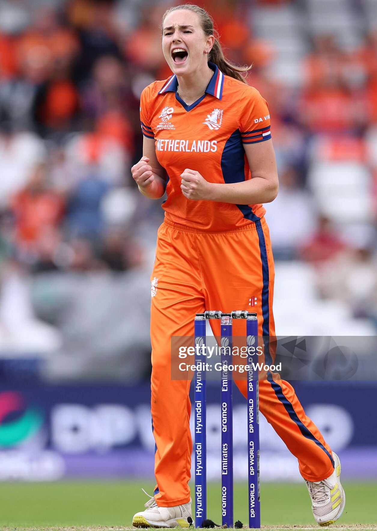
Netherlands are appearing in their first T20 World Cup and Gray Nicholl’s have given them a striking uniform. I initially had this uniform down the bottom of the list but the closer I looked at it; the more it drew me in. First up is the deep bright orange that all Netherlands teams wear and the use of dark blue as the accent colour gives us a nice colour difference in this tournament. The Netherlands flag colours make up the fold out collar and the flag is also on the bottom of both sleeves. There is also a subtle lion print all over the jersey. While the Netherlands won’t go close to winning the competition, they sure will turn some heads with their classy uniform.
4 – South Africa

Another jersey that’s been seen a fair a bit with the mens team wearing the same design. A nice dark green textured graphic on the front of the bright yellow jersey makes this jersey pop and i’m a big fan.
3 – West Indies
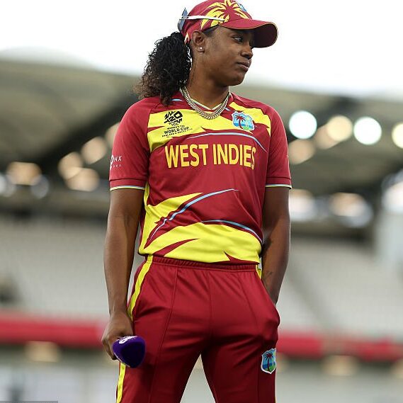
An unmistakably West Indies uniform with a yellow palm frond sitting on a deep maroon base is a beautiful sight. A bold yet simple design which is a winner in my eyes and Macron have knocked it out of the park.
2 – Scotland
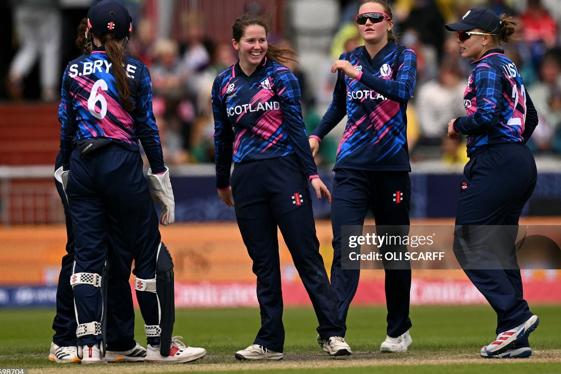
Another stunning kit from Gray Nicholl’s, this time for Scotland. A deep, deep blue base with a lighter blue and pink graphic, makes this jersey stand out like no other at the tournament. You may notice the tartan design on the arms, which ties in the Scottish heritage. The design is a great look for the Scottish women’s team, and I love the direction they’ve gone in.
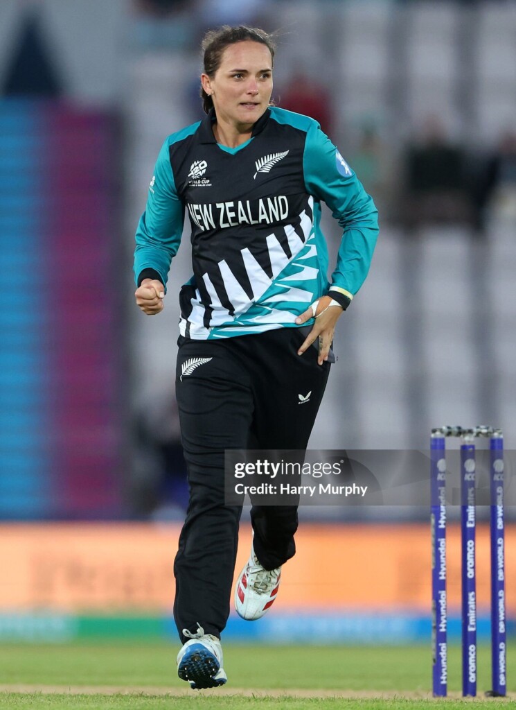
1 – New Zealand
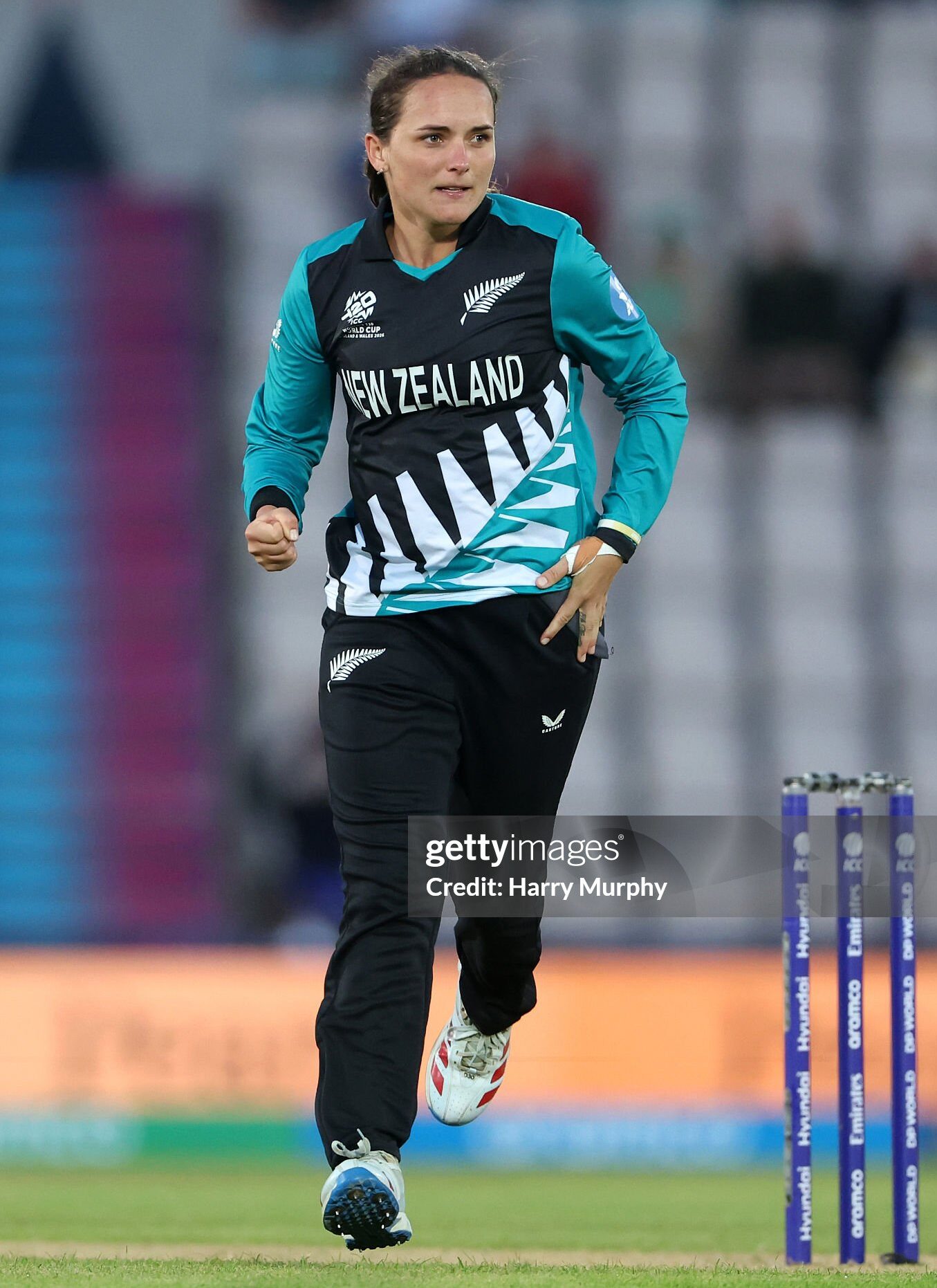
Oh my what a beauty! The massive kiwi fern which takes up the bottom half of the jersey is bold and is exactly what should be rolled out for a T20 World Cup. Sitting on the charcoal base, the teal grabs the eye and doesn’t let it go. New Zealand once again prove they are the benchmark in creating eye catching designs. My favourite jersey of the 2026 Women’s T20 Cricket World Cup.


What do you think of my list? Where would you have placed each jersey? Let me know below in the comments.
All images taken from Getty Images for reference purposes only.