The Pakistan Super League is the main T20 cricket competition in Pakistan, and I have ranked all 15 jerseys from the 8 teams. Let me know in the comments what your ranking of the 2026 PSL T20 cricket jerseys are.
15 – Peshawar Zalmi – Home
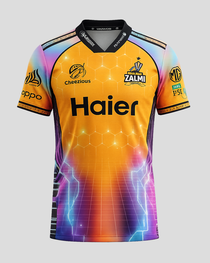
Good – Futuristic and inventive design. Sponsor integration perfect.
Bad – Too many colours and it’s a little too out there for a cricket jersey
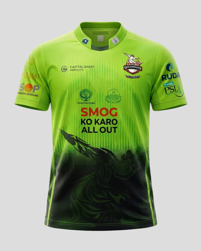
14 – Lahore Qalanders – Away
Good – Colours and sponsors
Bad – Dark red into black gradient muddles out the design
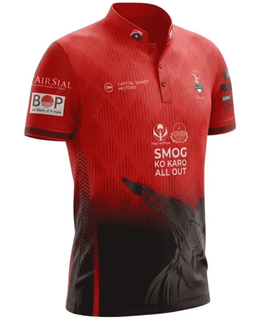
13 – Rawalpindiz – Away
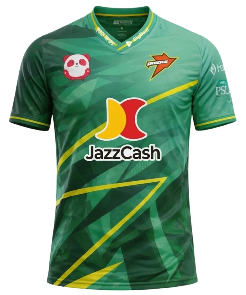
Good – Nice colours used
Bad – Horrible Sponsor and logos integration
12 – Lahore Qalanders – Home
Good – Colours blend nicely together
Bad – The gradient stops halfway on jersey and while colours work together well, it’s too stark contrast. Littered with sponsors and don’t work with design.
11 – Rawalpindiz – Home
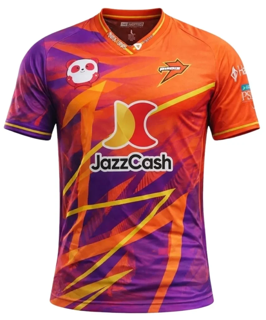
Good – Unique colour pallete
Bad – Colours clash & the design is just random triangles.
10. Karachi Kings – Away
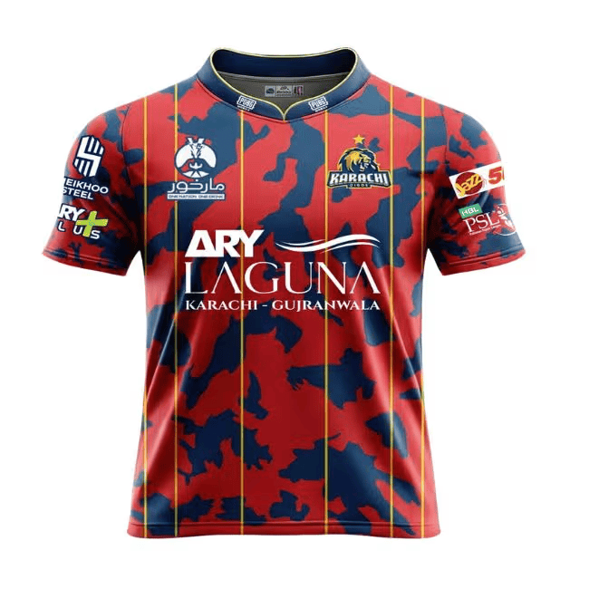
Good – Colours work well together
Bad – Sponsors on sleeves are not integrated well and the design looks like a cow’s hide
9 – Multan Sultans – Home
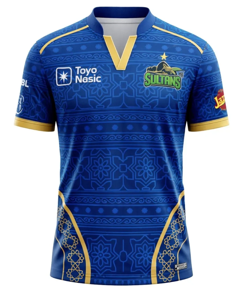
Good – Blue and gold with a cultural design really gives air of prestige.
Bad – The design on the sides going over to the back ruins the base design. The Multan Sultans green logo doesn’t work with the blue base.
8 – Islamabad United – Away
Good – Really nice blue color and the sponsor integration is great.
Bad – Just a bit plain & a pretty boring geometric design that gets lost on the field
7 – Multan Sultans – Away
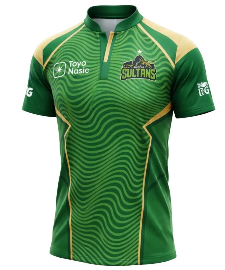
Good – Green & Gold work well together
Bad – Boring design and i’m not sold on the collar style.
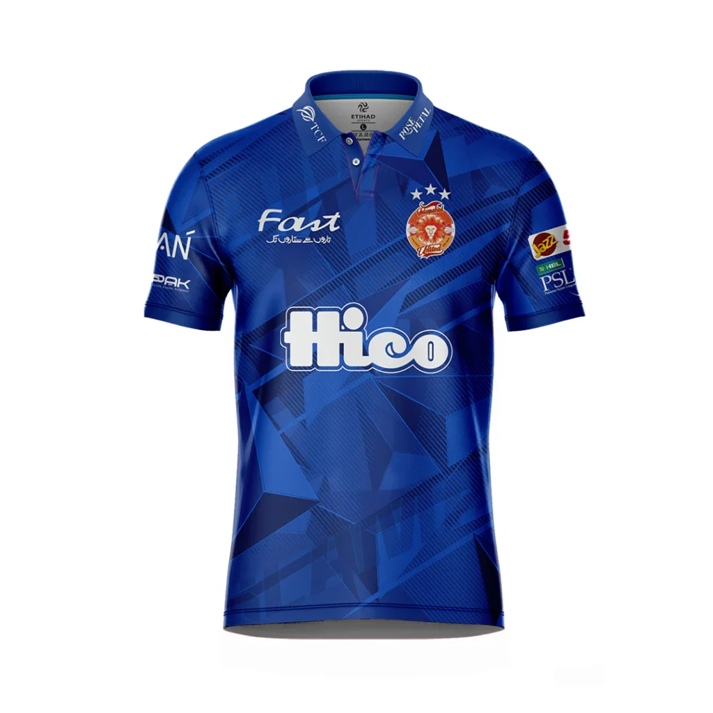
6 – Islamabad United – Home
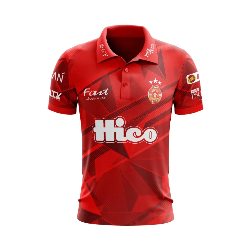
Good – The different shades of red work well with the main sponsor
Bad – Much like the away, the design doesn’t offer much
5 – Karachi Kings – Home
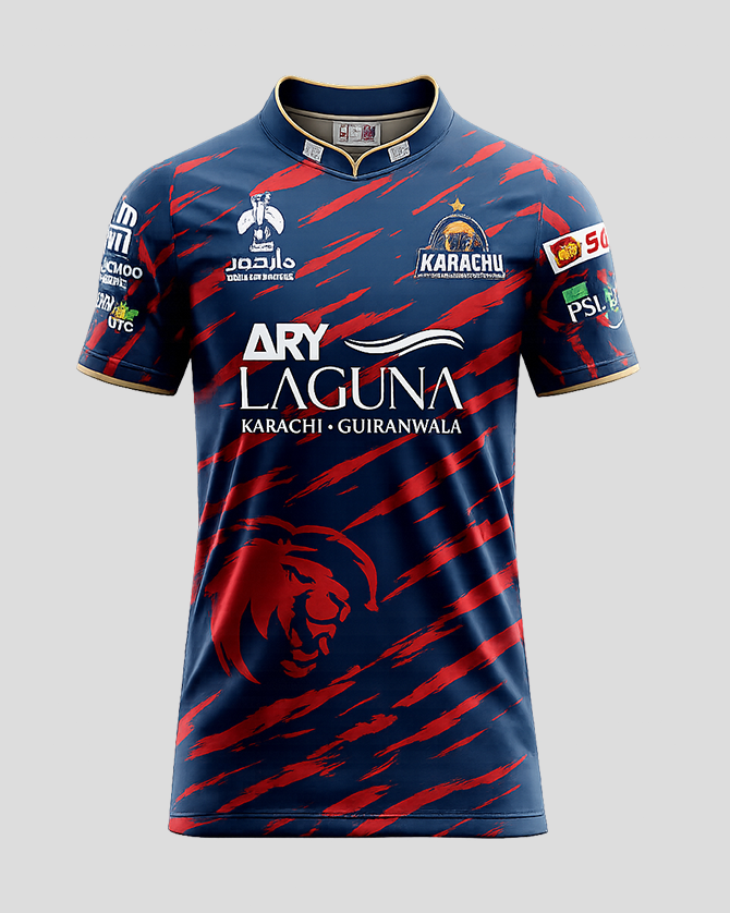
Good – Design is great with a lion logo and diagonal red stripes on a blue background
Bad – Sponsors on the sleeves cramp the jersey. While the colours are great, they might blend on the field.
4 – Hyderabad Kingsmen – Away
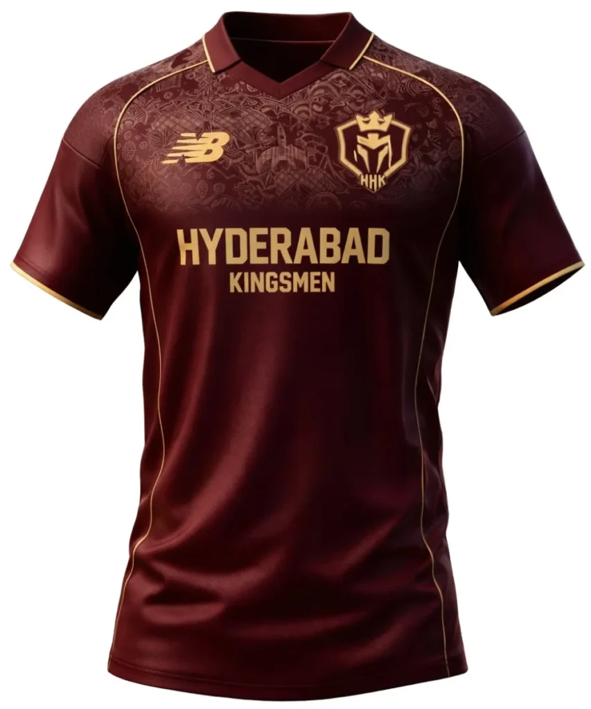
Good – Not far off the home jersey but the maroon colour doesn’t work as well as the black.
Bad – Same issue as home, with the design getting lost.
3 – Quetta Gladiators – Home
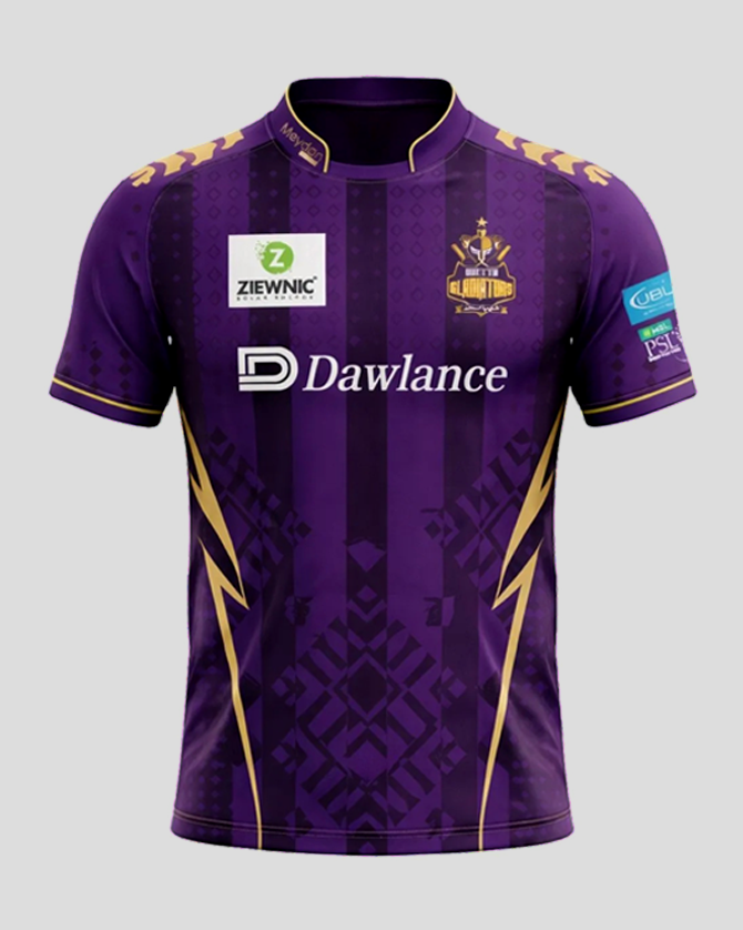
Good – Purple and gold give royalty vibes. Design is great.
Bad – Sponsor integration isn’t great with the big white box on the right chest and the design has too many things going on with it. Stripes, cultural design, chevrons and lightning bolts. It’s all a bit of a mashup.
2 – Hyderabad Kingsmen – Home
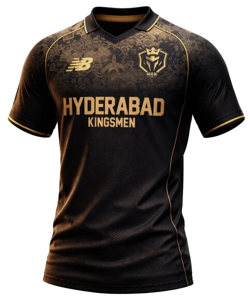
Good – Charcoal & gold really make this jersey pop. Sponsor is perfect
Bad – The design at the top while it is brilliant, can only really be seen up close.
1 – Peshawar Zalmi – Away
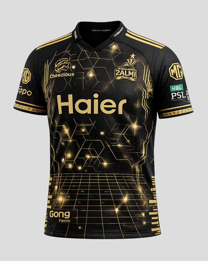
Good – It’s the same design as the home, but it really pops in the black and gold colours..
Bad – The blue sponsor on the left sleeve is my only gripe with this jersey.
What are your thoughts on my 2026 IPL jersey rankings? What is your order?